Extending the InvenioRDM Deposit Form
When I first started work on Knowledge Commons Works, one of the first things I built was an extension to add several layers of functionality to the stock InvenioRDM deposit form: invenio-modular-deposit-form. Three years later, that extension has matured and been rewritten from the ground up to be re-usable by other InvenioRDM instances.
Born from our UX research
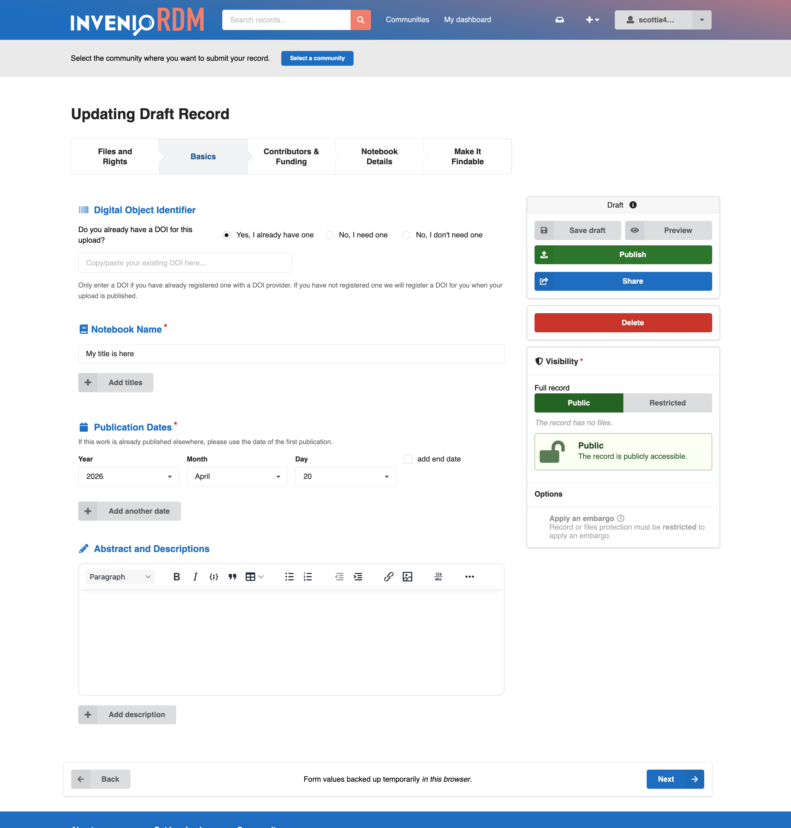
Early on I was handed the challenge of adding several things to the stock InvenioRDM upload form. Our team had been doing UX research with our user base, and had come up with some recommendations. The stock form was a bit overwhelming for users. They wanted a stepped form that let them deal with just one section at a time. They wanted a form that adapted to the resource type they were uploading. It should be smart enough to recognize that I don't need to see the "Journal Title" field if I'm uploading a dataset. They got frustrated when they refreshed their browser, or closed the tab, and lost all of the values they'd been entering. And they didn't want to wait until they submitted the form to find out they'd missed a required field or that their publication date wasn't formatted properly. They wanted immediate feedback. Finally, they wanted the fields to be grouped differently than the stock form arrangement, and that included bringing "custom" fields from the bottom of the form into the main form sections. Along the way, we rearranged the form fields several times, convincing me that I needed to be able to change the form's layout without rewriting templates every time.
And so the invenio-modular-deposit-form was born. The first version was not a very elegant beast and it was also very tightly coupled to our own InvenioRDM instance. As I learned more about InvenioRDM's internals, I also heard other developers talk about needing similar features. So when I had the chance to revisit our deposit form, as part of our upgrade to InvenioRDM v13, I took the opportunity to rewrite invenio-modular-deposit-form as a cleaner and fully generic extension.
Now we're finally ready to share the extension and see whether it can be useful to others.
Five layers of added functionality
Fully configurable layout
Form layout with the extension is driven entirely by a configuration object. So it's quick and easy to move fields around in the form, and swap out different field components, without touching any React code. Layout is configured declaratively, using a Python dictionary that describes a tree of React component names. At the top of this component object we name six basic form regions (title, form header, centre column, sidebars, and form footer). Inside each of these regions we can place structural components (like form rows, or form sections). Then individual field components can be nested as desired in those structural elements.
While the form layout dictionary has a simple structure, it also allows great flexibility because it can pass any desired class names and other props through to the React components themselves. This allows for, e.g., using responsive css classes to add responsive behaviour to any component. It also provides one central place for defining (or overriding) things like field labels, descriptions, etc.
Custom fields anywhere
Custom field inputs can be placed anywhere in this layout configuration, mixed as desired with the rest of the stock InvenioRDM fields. This is made possible by a CustomField wrapper component that reads the standard custom fields UI configuration.
Stepped form progression
The form fields in the centre column can be divided into a set of form pages, allowing users to interact with the form as a series of manageable steps. The extension also provides two different navigation components: a button-based stepper component that fits at the top of the form, or a vertical menu that can be displayed in either sidebar.
Just as the form sections, fields, and regions can be made responsive via classes, whole form pages can be set to display only at certain display dimensions. For example, the form submission buttons could be displayed in a sidebar on wider devices and then moved into a separate page of the form on smaller screens.
Extensible component registry
Behind the scenes, this layout is driven by a FormLayoutContainer component that is responsible for reading the configuration at runtime and arranging the form fields. The registry of available form components can be extended via an entry point, allowing instance maintainers to use their own React components--either for custom fields or simply to add alternate components for existing fields.
Adaptation to resource type
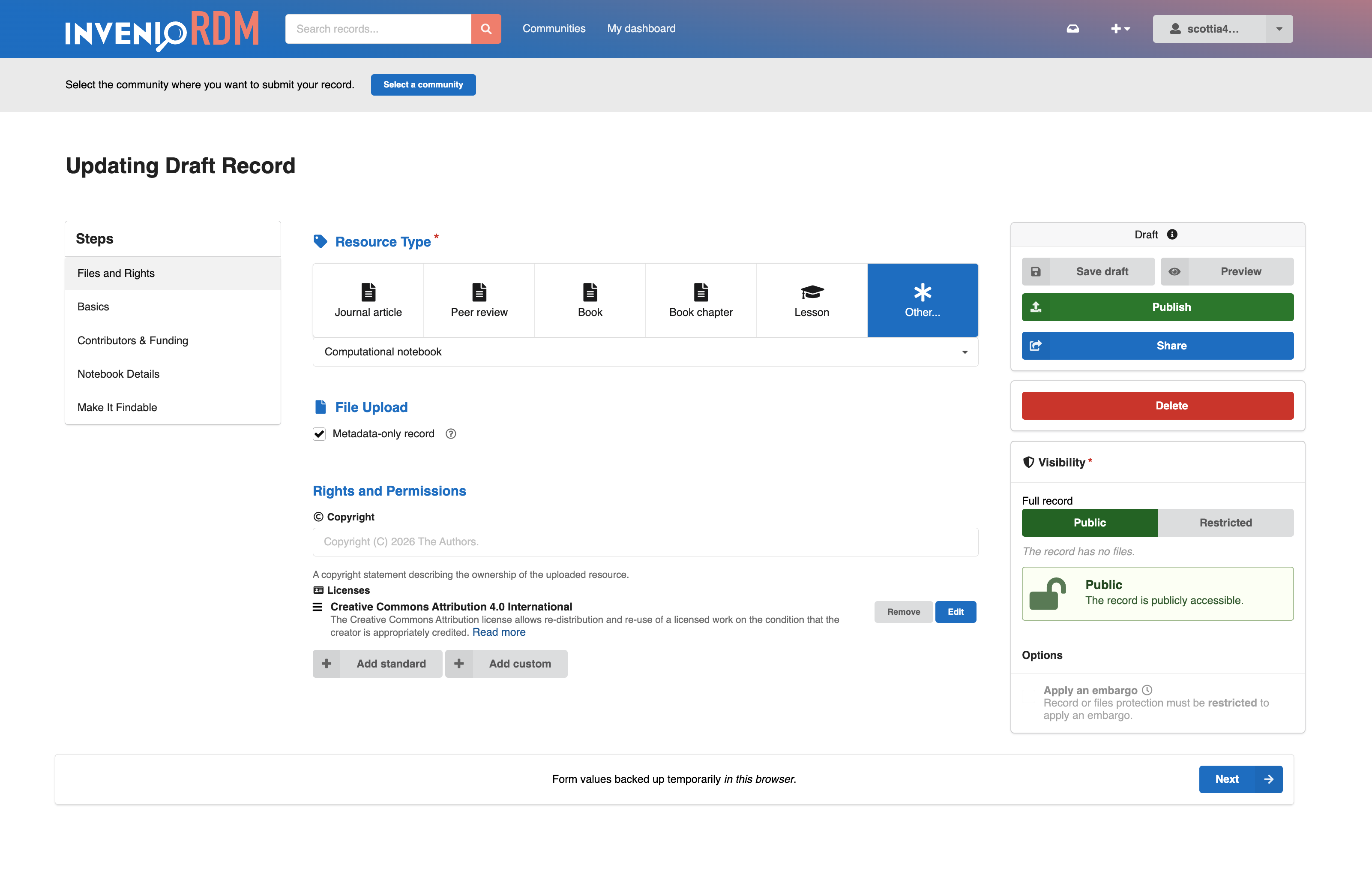
The form layout can also adapt to whatever resource type is currently selected. Alongside the main form layout configuration object, a second dictionary can be used to define layout overrides for any resource type. Fields can be rearranged, shown, or hidden instantly when the resource type is changed. And props in these override configurations can be used to adapt field properties to the selected resource type, so that the field label, default values, description, etc. remain relevant to the kind of material being deposited.
Client-side validation
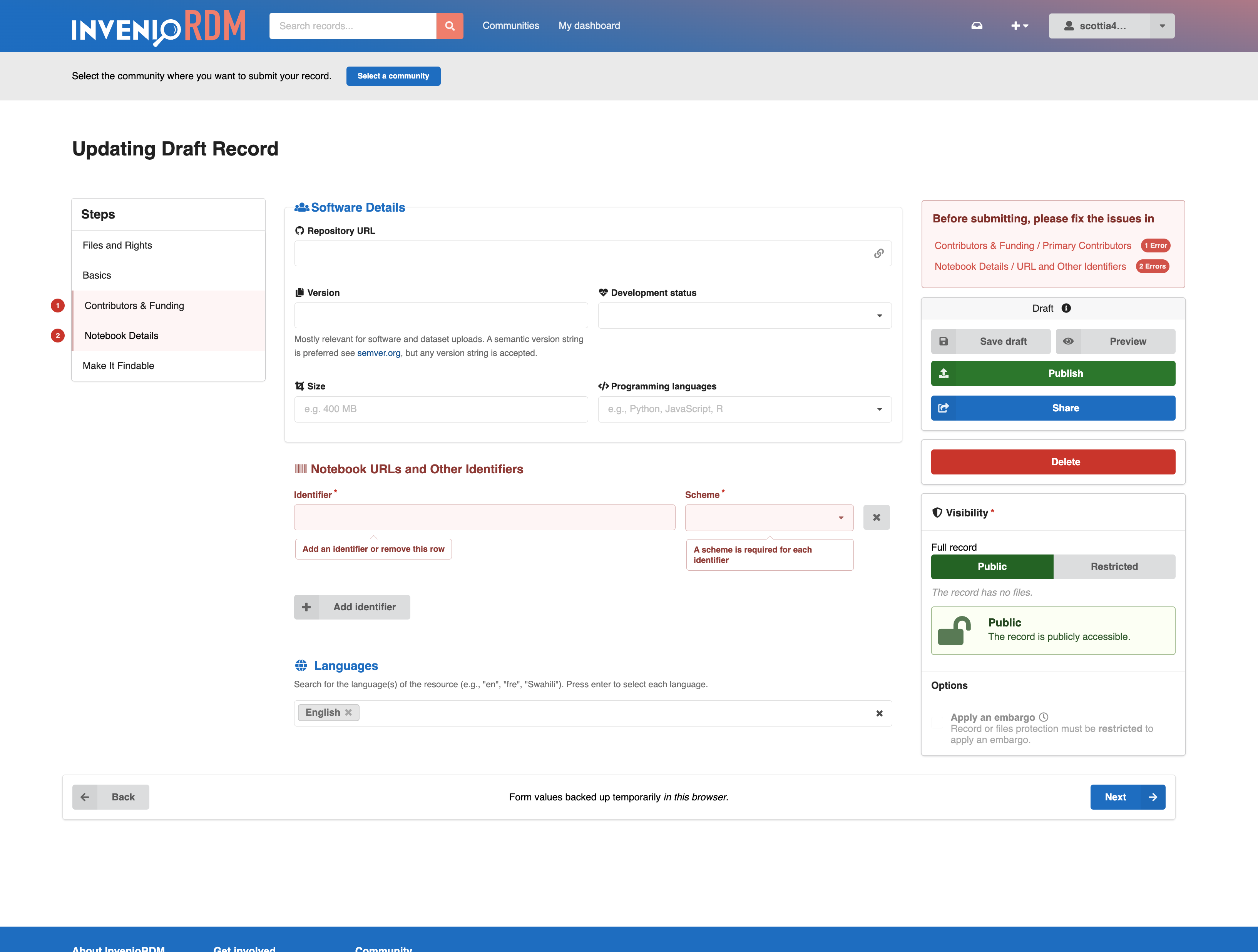
The invenio-modular-deposit-form extension also adds immediate client-side validation of the form fields, letting users see immediate warnings if there are problems with a value they've entered. Error tooltips are displayed in-place above the affected fields, and error labels are shown on the stepper or menu components for any pages that have errors. A separate FormFeedback component can display a summary of form error messages in any region of the form layout.
This validation is driven by a Yup validation schema that duplicates as closely as possible the validation that InvenioRDM performs on the back end when a draft is submitted. This schema can also be customized or extended as desired.
Autosave and restore
In addition to the configurable layout and client-side validation, the extension also adds autosave and restore to the form. As the user types, the form's current values are stored in their browser's local storage. If the user leaves the page before saving a draft to the back end, when they return to the form they are prompted to either restore these locally backed-up values or discard them and start fresh. Separate backups are stored for each draft id and each user working in the same browser, so that unsaved values aren't lost if a user switches from one active draft to another.
Form pre-submission transformations
Finally, the invenio-modular-deposit-form extension provides an extensible hook to modify any of the form values when the user clicks "save draft" or "publish". No transformations are included by default. But instance maintainers can use a final entry point to supply functions that modify any of the field values on form submission. So one might, for example, catch records that do not include a "publisher" value, and add a different default depending on the resource type, the selected community, or even the institutional affiliation of the record's creators.
Bonuses
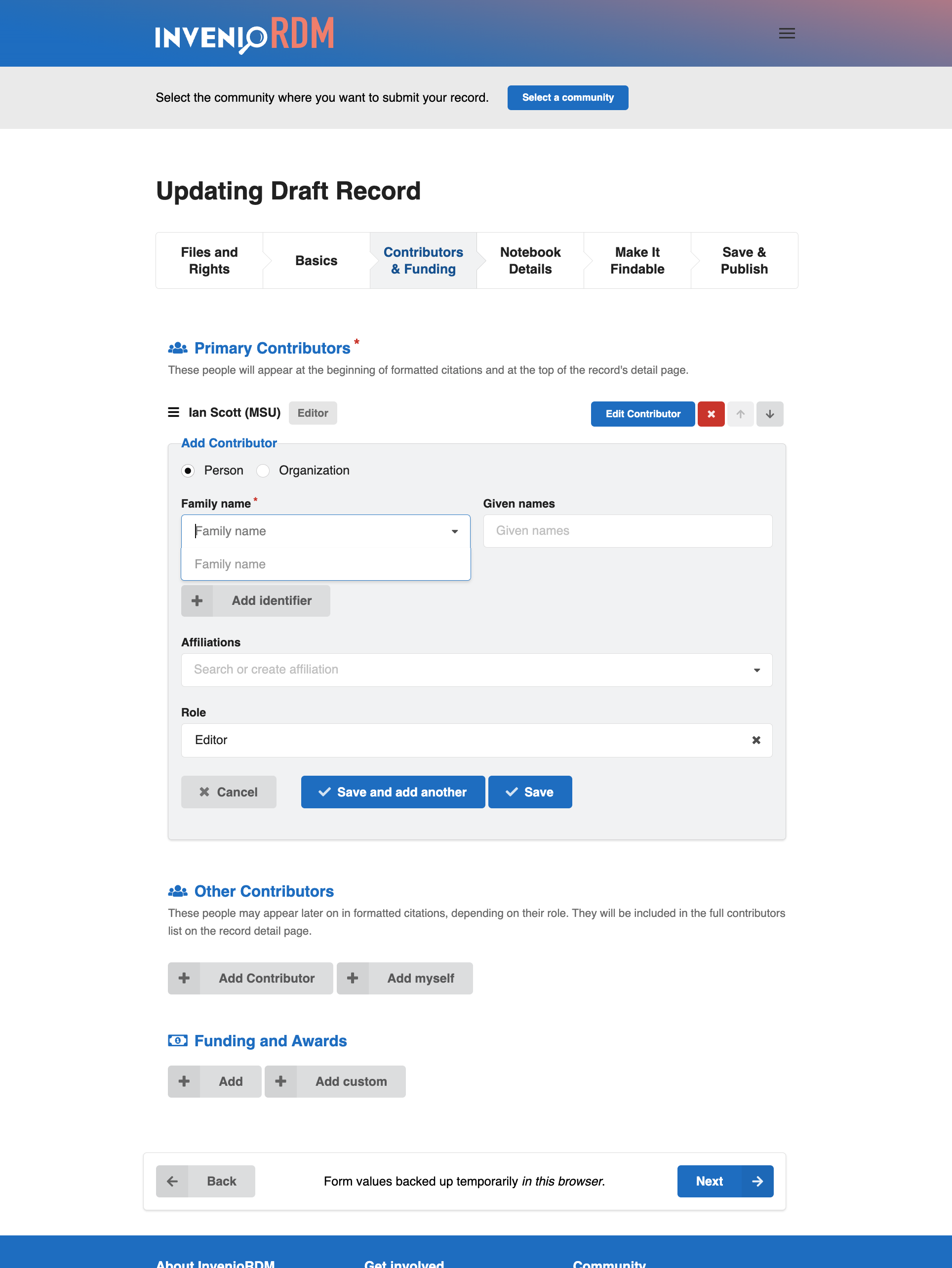
Along the way, we've also developed alternate versions of some form fields that are included with the extension. These include a Creator/Contributor field that uses collapsible inline fields (instead of a modal) and an alternate publication date field that provides separate year, month, and day selectors, ensuring that entered dates are formatted as proper EDTF strings. These are included, in part, in the hope that others might also share their own alternate components.
How does all of this get added?
My basic approach in writing invenio-modular-deposit-form has been to modify the stock form as little as possible. Most of the added functionality comes from (a) a custom deposit form template, and (b) two React components that live between the stock form's API/Formik bootstrapping layer and the actual form fields: FormUIStateManager for keeping track of the form's dynamic state, and FormLayoutContainer for setting up the configurable layout. This is complemented by structural components for various form regions and layout sections (FormSection, FormRow), as well as by wrapper components that feed the individual fields with the props and configuration values they need (FieldComponentWrapper, CustomField).
The ideal goal is to make this layer work with the stock InvenioRDM form field components as is. We're not quite there yet. The invenio-modular-deposit-form currently comes bundled with forked versions of many components, since slight changes were necessary to get aspects of the client-side validation and per-type adaptation working. The hope is that I'll be able to upstream enough of these changes to drop most of these forks.
An example of the possibilities
Our invenio-modular-deposit-form extension doesn't aim to be the perfect deposit form. Our goal has, instead, been to make the stock InvenioRDM form as flexible as possible, to extend its functionality to meet an even wider variety of needs. Many of us who develop and maintain InvenioRDM instances have made the deposit form our own. I hope our work provides one example of how we might make these kinds of customizations easier to implement and maintain for all of us.